§ 00 / TEAMS FOR EDUCATION
Modernizing online classes for an authentic virtual experience.
- ROLE
- Lead interaction designer, virtual classroom
- PLATFORM
- Microsoft Teams for Education
- TIMELINE
- 2020 – 2021
- TEAM
- Cross-functional team of design, research, and engineering
- MY FOCUS
- Classroom orchestration, virtual tables, teacher controls
- STATUS
- Patterns shipped; concept influenced future Teams direction
COVID brought millions of new students to online classrooms
At the height of the pandemic, Microsoft Teams became a lifeline for education, used by over 150 million students and educators worldwide. Growth was massive, but it was fragile. Our team was tasked with figuring out how to retain it.
The initial ask was about growth metrics, specifically how to keep the numbers up. But through a rigorous design process loop of research, synthesis, and prototyping, we discovered that the real lever for retention wasn't feature additions.
That reframing changed everything. Instead of optimizing for adoption metrics, we focused on what was actually breaking down in the virtual classroom experience.
The retention strategy became inseparable from the user experience strategy. My role centered on leading that design process and shaping the interaction patterns that emerged from it.
Engagement collapsed when classrooms went virtual
Teachers became operators, not educators. They managed attendance, read chat, spun up breakout rooms, debugged audio problems, and lectured all at once. Reading the room meant staring at a grid of boxes and guessing who was actually there.
Students retreated. Raising your hand meant speaking to thirty people at once, into dead silence, with no response. There were no whispered questions to a neighbor. No one to nudge you back into focus. So most just turned off their cameras.
In person, schools have architecture. Small groups, seating arrangements, a teacher moving through the room. Learning happens in conversation. Online, it collapsed into broadcast.
Teachers couldn't see who was falling behind. Students couldn't feel like part of a group. The system worked for lecturing. It failed at learning.
FIELD INTERVIEWS · STUDENT VOICES
“I'm not that good in math so when we go back to in-person learning I'm looking forward to group discussions”
“When I'm at home I don't feel like I'm in class. I'm looking forward to having the feeling that I'm in school and I'm in class and having that dynamic with teachers to talk to them after class or just have a physical connection rather than through a screen.”
“Most of my teachers randomly put us in breakout rooms and sometimes it's a really quiet room. But for me it's less awkward to break that silence than try to break a silence of over 30 kids in a class because I would rather talk to a group of 5 kids than 30 people. When you're in smaller breakout rooms it's easier. It's just a bigger audience thing for me.”
“I'm looking forward to going back to in person learning for the group activities, I liked working with my peers. For virtual group classes, it just felt good to see my friends and we can actually talk and stuff like that.”
§ 03 / 09
Research
Designing from real classroom behavior
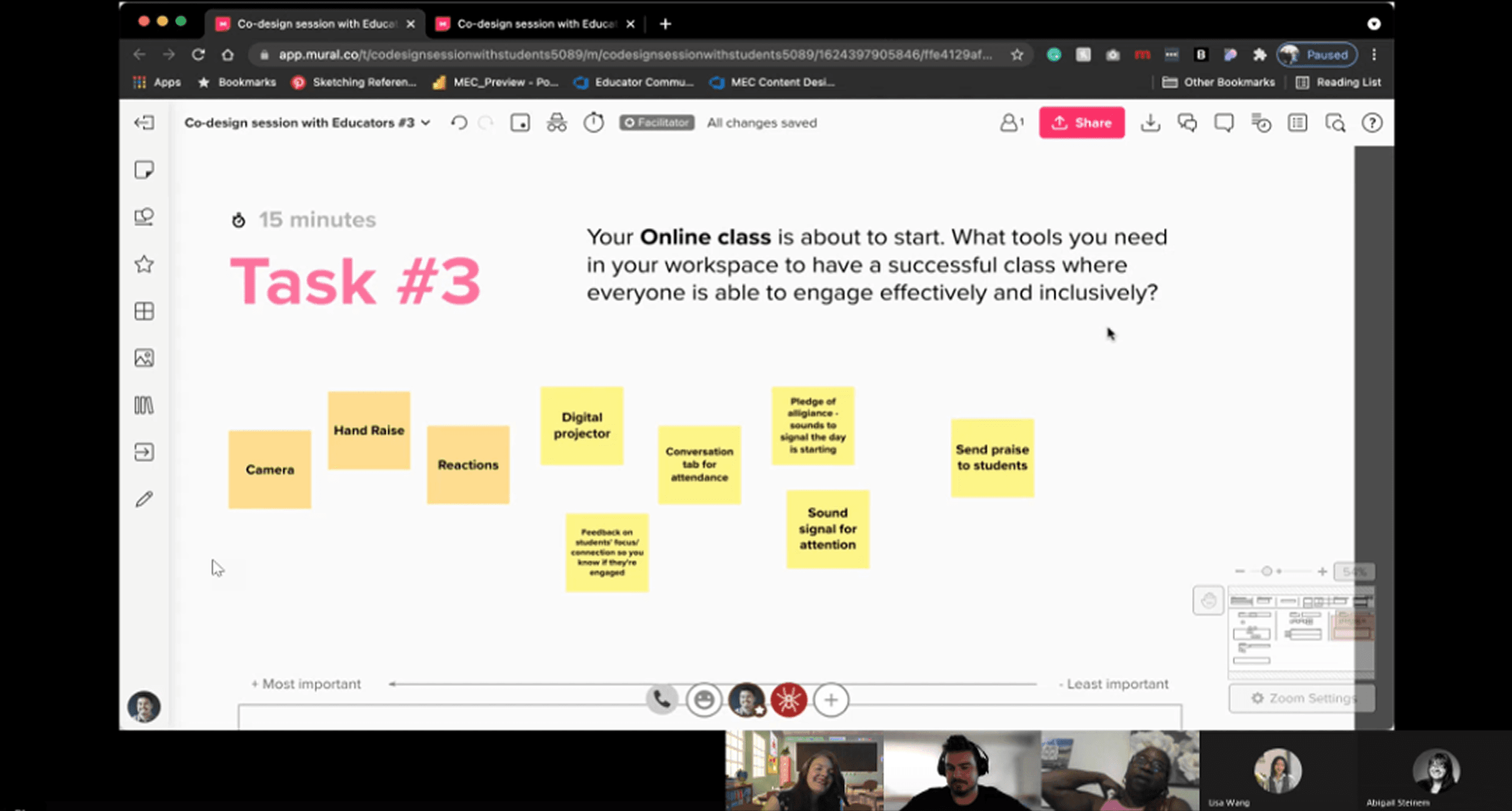
Before designing anything, we ran extensive research with students, parents, and teachers to understand their daily experience inside Teams. I led several of these sessions to map the full day-in-the-life of both educators and students.
We observed where engagement broke down, when energy dropped, and what felt emotionally uncomfortable in a virtual classroom. These sessions were not about usability tweaks. They were about understanding how it felt to spend six hours a day in small boxes on a screen.
Reintroducing structure without turning Teams into a cartoon classroom
We explored three directions. The first was too literal: full classroom maps with avatars at drawn tables. It was playful but felt gimmicky inside an enterprise tool. The second was too abstract: purely functional renamed breakout channels that lost the spatial awareness that made the concept work.
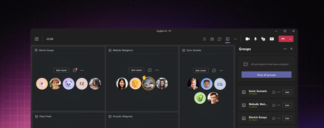
The third struck the right balance: virtual tables. Persistent table cards in a grid with fixed seats, visible neighbors, and stable group identity.
We designed persistent table cards arranged in a grid. Students sat in fixed positions within these tables, with their avatars resting in consistent seats. This approach restored spatial awareness without sacrificing clarity. It was structured enough to feel real, but restrained enough to feel native inside Teams.
There was a harder tension underneath the table design. Teachers needed moderation controls (the ability to mute, redirect, or flag), but heavy-handed moderation kills exactly the kind of organic peer discussion that makes small groups work. We designed moderation to be ambient rather than disruptive. Teachers could observe and intervene from the global view without pulling students out of context or signaling to the whole group that someone was being corrected. Control stayed with the teacher. The conversation stayed with the students.
Giving teachers the room back
Virtual tables were only part of the solution. Teachers could start table discussions and monitor the classroom from a global view, moving fluidly between groups almost like walking around a physical classroom. The orchestration layer restored situational awareness, giving them a cohesive classroom instead of fragmented breakout rooms.
Discussions don't pause when someone steps away. We designed re-entry to surface enough context (recent activity, shared materials, who's talking) so a student could orient and join without interrupting the flow already happening.
Preparation moves outside the meeting
Previously, breakout rooms had to be created dynamically during the meeting. That meant instructional time was lost while groups were assigned and logistics were sorted out.
With virtual tables, teachers could set groups before class. They could assign students to consistent seats and attach materials or instructions to each table in advance. When class began, students entered their assigned groups immediately.
This made attendance easier, transitions smoother, and the start of class far more focused. Preparation moved outside the meeting, which allowed learning to begin without friction.
Persistence went beyond seating assignments. Discussion threads, shared materials, and group context carried forward between class sessions so the next meeting didn't start cold. Students returned to a table that remembered where they left off. Teachers didn't have to re-establish groups or redistribute resources every session. That continuity turned virtual tables from a single-meeting feature into a classroom structure that accumulated meaning over time.
Familiar group members. A recognized seat. Accountability to the people around them.
Reinforcing belonging
§ 09 / 09
Impact
What we learned
Testing showed what mattered. Teachers moved between groups faster. They spotted struggling students quicker. And most important: students spoke up more often when they weren't performing for thirty people.
The full virtual tables concept didn't ship exactly as designed. But the patterns lived on. Persistent class context. Structured groups. Clearer visibility into participation.
The work stretched beyond education too. How small groups get visibility in enterprise meetings. How structured participation scales when you have more than thirty people in a call.
Retention turned out to be simple. It doesn't come from more features. It comes from the same thing physical classrooms are built on: structure. Social connection. Being seen.